Klinio app updates: Home Page Improvements

We’ve heard your feedback about the Klinio app. So, today, we’re super excited to share some information on the newest app features.
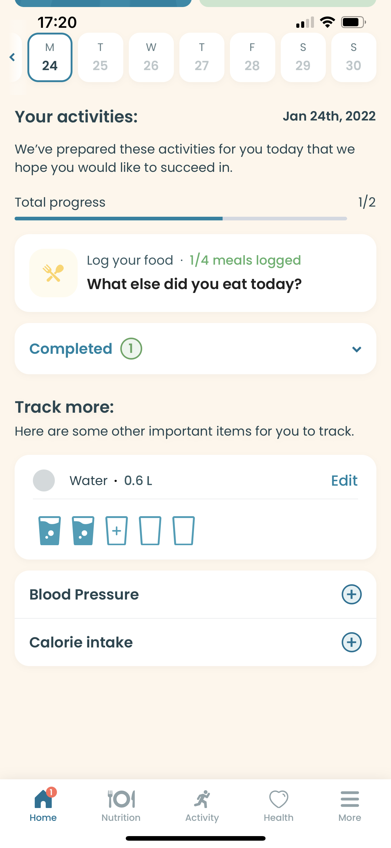
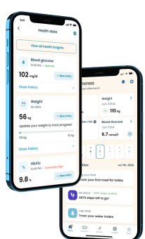
Now, the Klinio app has an improved and better-organized home page. With this newly upgraded home page, users will access tracking features easier and quicker than before.

So, what changed? Firstly, the Klinio team redesigned current widgets into a more compact layout for better relevance. Now, you won’t need to swipe through widgets as before – all the widgets will be in one place.


What’s more, the Klinio team has introduced new widgets for tracking weight and eA1c estimations. These new features will allow users to access main health tracking metrics more conveniently without going to a different page.
The final home page feature that got introduced is the diabetes risk and management score. This new feature was built to provide insights into users’ condition and their progress. The diabetes risk score will take only a minute to calculate and provide foresight into your health status. Ultimately, this score will help you better understand how your nutrition and lifestyle habits will affect you in the future.
Also, we need to mention that scores are different for each condition. Meaning that the risk score is for people with prediabetes, and the management score is for those with type 1 and 2 diabetes.
Take a quiz and get your diabetes-management plan today!


